A clear path forward
Cobscook Financial needed an identity that was true to the founders’ roots — A Maine native whose top priority is to help his neighbors.
CREATIVE DIRECTION: Bernie Deshaies
ART DIRECTION: Bernie Deshaies
DESIGN: Bernie Deshaies
COPY: Bernie Deshaies
Color
Using inspiration from Cobscook’s striking coastal sunsets, we created a palette that was both approachable and distinct from the competitive landscape.
Serious Sans
To further separate the identity from competitors and capture that neighborly feel, we chose a typeface that was both clean and quirky.


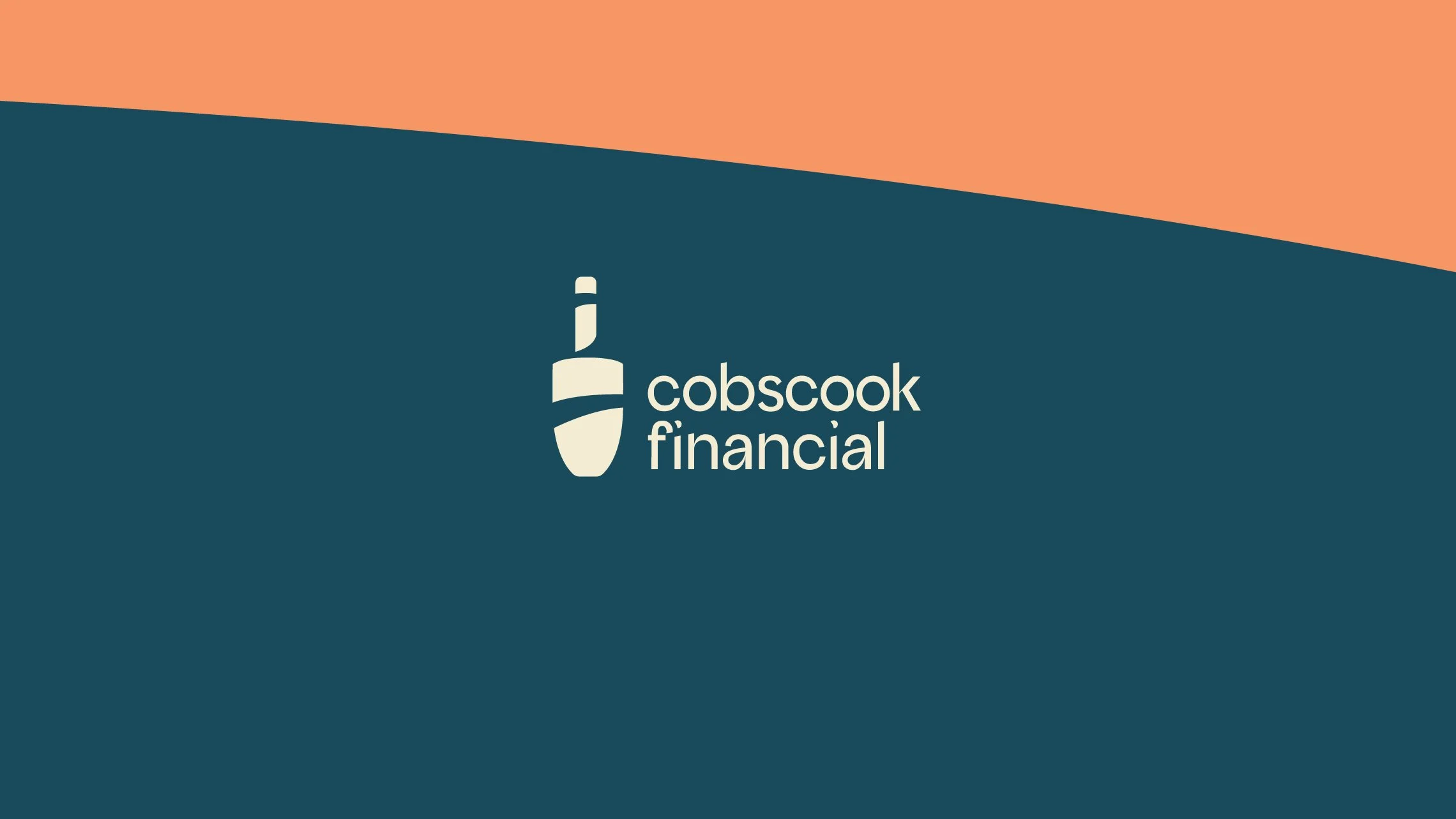
Logo
Lobster buoys are a staple of Maine, especially in coastal towns where you can find them lining the walls of cottages. Using this as a symbol, we curved its lines to create pathways leading up the buoy itself. As an added touch, we did the same between the “f” and “i” in the wordmark to make it truly distinguishable.

Visual ID
Distilling the state’s most iconic scenery into shapes, we pushed the concept a step further by creating pathways throughout the brand’s visual identity.