Traveling better
Approaching Chalk, a client needed to kick the legs on a fresh idea for a startup.
creative direction: Chalk 242 & Bernie Deshaies
art direction: Bernie Deshaies & Chalk team
design: Bernie Deshaies & Chalk team
copy: Chalk team
Color
The main palette of light grey, forest green, and a golden sun-like yellow helped give the brand a high-end feel, while the added accents of orange and stone-like black added depth to ensure the brand didn’t feel unnaproachable.

Font
Classico URW was chosen to add a sense of timelessness to the brand as a whole.

Classico URW
Logo
With subtle movement, the wordmark gives homage to the essence of this lifestyle, while the icon allows us to subtly stamp the brand on various digital and physical touchpoints with a feeling of luxury.
Additional elements
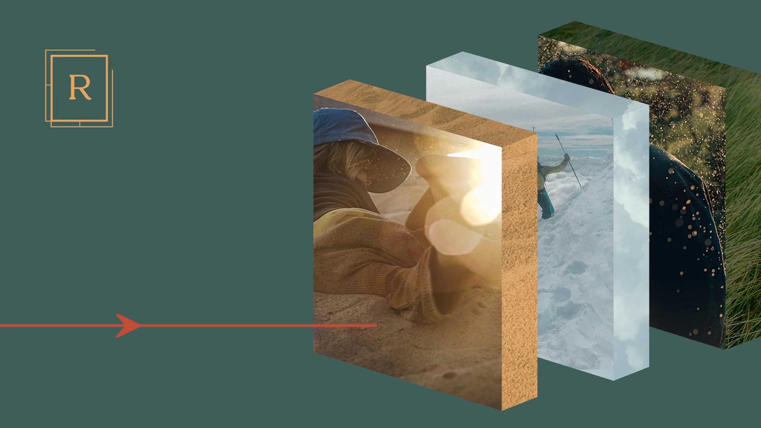
Utilizing portal-like shapes to frame the photography, we aimed to transport our audience to see themselves in the lifestyle we illustrate.
Shapes such as these elegant arrows, and ovals that feature accent copy, help elevate the brand as a whole and create a distinct and identifiable look.


